
Template
Knowledge and magazine
The predefined areas in this template can be duplicated and changed within. Make sure that the individual sections always alternate between a white and grey background (#f8f8f8).
You can simply leave fields in the text block (Lepona elements) empty that you don't need. Remember to select the title tag correctly in order to display the document structure correctly.
Of course, you can also delete entire blocks or add new ones. This template serves as an example structure.
Bay – warm coat that goes with almost anything
A bay is the absolute classic: a warm, rich coat with black mane and tail, and most stables have several of them. When styling you are in luck with a bay, because the deep coat is enormously forgiving and works with almost every colour direction.

Tagline
Title H2
Vertical alignment: Centre, if the text is next to an image.
The beige “Velvet Pearls” set on the horse is soft and completely tone-on-tone. If you prefer more contrast, go for this one: deep Navy with sparkling crystals. Cool blue is my favourite trick on a bay, because it makes the warm reddish-brown really glow without being loud. At the showground it looks elegant, and in photos even more so.


Black: maximum contrast, maximum impact
The black horse is the diva among coat colours: deep black, glossy and full of drama. Exactly this strong coat is special when styling, though, because dark tones almost disappear on it. On the other hand, the right colours shine on a black horse like on no other coat colour, and even delicate tones like rose or taupe come across surprisingly well.
Tagline
Title H2
Vertical alignment: Centre, if the text is next to an image.
The set on the horse goes for bold orange. If you prefer something more muted, this one is a safe bet: Racing Green meets Navy – a deep, rich green that looks elegant rather than loud on a black coat. Robust enough for everyday training and still an eye-catcher.


Grey – the perfect stage for bold colours
On a grey you have almost free choice: nearly every colour works on the light coat, and you can really go for it. Saturated, bold tones give the most pleasure, while pale shades quickly disappear and make the look feel washed out.
Tagline
Title H2
Vertical alignment: Centre, if the text is next to an image.
Grey on a grey horse sounds at first like exactly what I talked you out of above. Here it still works, because the herringbone pattern with its deep black provides the contrast that pure grey on a light coat usually lacks. Especially on a completely white coat this set looks wonderfully extravagant.


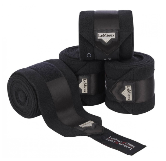


Styling a chestnut properly – cool tones for a warm coat
The chestnut has a reputation for being tricky to style, but it only needs the right direction. Its reddish-brown coat is a real eye-catcher when the colours match – and pretty merciless when they do not.
Tagline
Title H2
Vertical alignment: Centre, if the text is next to an image.
If you like it by the book, green is a must. Pine Green is a deep fir green and the direct counterpart to the reddish chestnut coat. The two make each other glow, which is why this combo is for me the safest eye-catcher look on a chestnut. Elegant at the showground and an instant highlight in photos.


Styling a piebald: one clear colour, big impact
A piebald already comes with its own pattern, and that is exactly the sticking point when styling. Too many colours or patterns quickly make the already lively markings look restless. With a clear colour choice, on the other hand, it looks elegant and tidy.
Tagline
Title H2
Vertical alignment: Centre, if the text is next to an image.
A clear colour does not have to be boring. Dark green is rich enough to hold a piebald's markings together instead of making them even busier, and the pearl details give the set an elegant touch. Especially on piebalds with brown or chestnut patches, the deep green picks up the warm coat areas beautifully.


Buckskin – warm coat with a Western vibe
With its sandy coat, the dark dorsal stripe along the back and the black markings, the buckskin is a real gem. When styling, the community loves the Western and desert vibe.
Tagline
Title H2
Vertical alignment: Centre, if the text is next to an image.
Fancy warm instead of cool? Then this set in deep chocolate brown with golden accents is your thing. It sounds at first like brown on a sandy coat, but it works here because the brown is dark and rich rather than light and creamy. That way it picks up the black markings and the dorsal stripe without blending into the coat. Elegant, high-quality and just right for anyone who prefers calm to flashy.


In the end you decide
And now the most important thing: all of this is recommendations and popular combinations from the community, not rules. What suits which horse is ultimately a matter of taste, and taste is wonderfully varied.
If your heart is set on pink for the buckskin or you absolutely want to put pastels on your black horse, then do it. The most beautiful looks often happen exactly when someone consciously throws a supposed rule overboard. Take the palettes and sets here as inspiration and a starting point.
Combine things the way you and your horse like them.